Posts

Showing posts with the label graphic design

Practice graphic design by drawing simple birds

Image
  I love how you can use the same basic shapes repeatedly to make different species of birds. This is a simple beginner-friendly attempt at making the bee hummingbird. Here's the written tutorial .  For all my graphic design blogs, click here . 

Unraveling the magic of elements in graphic design

Image
  Graphic designer courses often include theories like color theory or meanings of shapes. Rarely do you find them in action. But, the best way to learn something is to do it. So, I decided to make graphic design. Then try to interpret which element has contributed to what meaning in it.  Why does this simple scenery convey the message it conveys? Let us examine the shapes, colors, and textures used here. All graphic design blogs by Subarna Creative. All blogs by Subarna Creative.

Color theory explained using mandala

Image
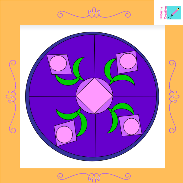
  The illusion of depth is like the magic of warm and cool colors. Place a cool color in the background and warm color in the foreground. A two-dimensional picture turns more meaningful.  This is where experimenting with color theory comes in.  I often make mandalas and it gives me peace. You will find mandalas throughout Indian temples. There is something magical about making a mandala. You start off with a blank canvas and draw a circle. You don't know where your inspiration comes from. But, when you lift your eyes off the canvas, a beautiful picture looks back at you.  I will use this mandala to describe warm and cool colors in color theory. And, I will also explain saturation, tone, and shade of colors in color theory.  The warm color is energetic and draws attention. It seems to come close to the viewer. Examples of warm colors include red, orange, and yellow. Cool colors like blue and green look peaceful. They don't attract much attention. They seem to mov...

Beautiful princess castles and color theory

Image
  The outline of a castle I read myriads of color theory blogs and summed them up in a bunch of blogs. Then I decided to experiment with color theory concepts. Thus I used some simple shapes in the Microsft word to draw a castle. Here is the outline.   Then I decided to use blue and purple to paint this castle. I have used different color temperatures, values, saturations, etc of these colors. So, the difference lies in color values. It can convey different meanings about the same castle.  Four different color combinations convey four different messages If you watch animated movies then these four images will look like the same castle. In different scenes, they depict it in different ways.  These four castles depict four different scenarios. The differences are subtle but important. Let us discuss them. An interpretation using color theory Colors create an illusion of depth This picture uses two warm colors and cool colors. Cool colors tend to recede to the back...

Graphic design blogs and art blogs by Subarna Creative

Image
Doodle Art Inspired by Indian Folk Arts Click here for the tutorial. India has a rich tradition of arts and paintings. I draw inspiration from all the Indian art forms when I doodle. Then, I color them using watercolor. These beauties are  a blend of tradition and modernity . If you want to know the bits and pieces of design that go into their making then here is a dedicated blog for you.  If you want to know what color schemes give the most attractive looks while coloring them then you are at the right place. Indian traditional art generally depicts nature and floral patterns. I enjoy making floral patterns because  there is no wrong way of making a floral design . You just have to let your creative juices flow.  With time and practice, you are able to create your own motifs and adore that blank piece of paper with them. You can choose your own color palette and create variations of a given painting. So, let's get started.  An Il lustrated List of Graphic Desig...

Color theory for designers

Image
Color theory math: RGB and CMYK models Read more What’s inside it? In computers, there are two methods to mix colors. These are RGB and CMYK . RGB color scheme means you are adding colors. CMYK color scheme means you are subtracting colors. JPEG or PNG images use the RGB color scheme. In CMYK, if you add all four colors then you get black . Meaning it is a subtractive model .   How to use the color wheel: complementary, triadic, tetradic, analogous, and monochromatic color schemes.  What’s inside it? Read more All brands have a certain color palette that resonates with their brand identity. How to choose that color palette? Here are some readymade formulae. But which triad or tetrad of colors should your brand choose? Or, should you go for a monochromatic color scheme? If so, then which color? Logos, color palettes, and brand personalities The Color Green What’s inside it? Read more Green is the color of nature. How can your brand leverage this powerful color to build its...